


If you know me, you know that I love blue and white, it’s a classic, timeless color combo. So it should come as no surprise that I’m using the blues and whites to inspire my mother’s day brunch table.


Here is an example of a blue and white table executed perfectly! The use of lemons and oranges add pops of color while not taking away from the simplicity of the table!!


This dress for summer…swoon.


To say I am excited for my upcoming trip to Miami, with my oldest and closest friends, would be a wild understatement. In preparation, I’ve started to plan (and shop) my packing list. I’ve taken a first pass at an inspiration board for the trip and would love to share it with you!
Please share any thoughts or advice for looking fabulous in Miami in May.

Here are some of the gorgeous images that inspired the board and purchases:
For the last couple of years inclement weather has pummeled the northeast in the month of February. This is when north easterners find themselves wondering what they are doing living in a place where the temps reach such awful lows and it is often hard to leave their homes. And then, we have Valentine’s Day, the day we can all forget about the nasty weather and celebrate love and romance…enter screeching record. As I recall, in my twenties, there was a fine line between loving February 14th and completely loathing the date along with the rest of February, it all depended on whether you were actually “in love”. Even if you were “lucky” enough to have a valentine, does he ever really get it right?!? I’ll leave that question up for pondering. I’ve learned to love Valentine’s Day for the onslaught of pink, girly gifts and for the idea that we should celebrate love whether it is shared with a significant other, a friend or family.
For fun here are a few things I’m inspired by this Valentine’s Day!
I would love for Mr. A to bring these home on Valentines Day
I absolutely love the idea of a friendship brunch for Valentine’s Day, is there anything better than champagne and your girls!
click here to see Brighton Kellor’s gorgeous girl’s brunch
Ohh, and Mr. A, I’ll take a pair of these, please!

Valentine’s Day outfit inspiration
And finally, some ideas for him…
So far, this awards season’s red carpet looks have not disappointed. From the stunning, simple and sophisticated Lupita Nyong to the gorgeously glowing Olivia Wilde the celebrities (stylists) have been nailing it. There are so many drool worth looks it is hard to choose our favorites. Instead, we’ve decided to choose four and find their interior design counter parts. Here are the looks we’ve selected for this game:
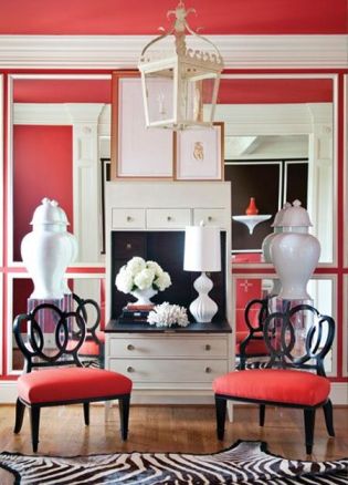
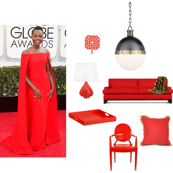
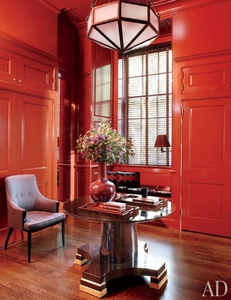
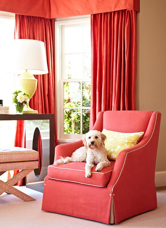
Starting with Lupita in the gorgeous Ralph Lauren coral / red at the Golden Globes, we almost don’t have words! The color popped off her velvet skin tone, this girl is everything we love about the red carpet and more. Reminiscent of the Tom Ford white cape ensemble Gwyneth wore to the 2012 Oscars, the silhouette itself is perfection. The Ralph Lauren color is mesmerizing in photographs we can only imagine how amazing it was in person. Somewhere between a perfectly red red and a bright coral red we swoon just imagining a room this color…

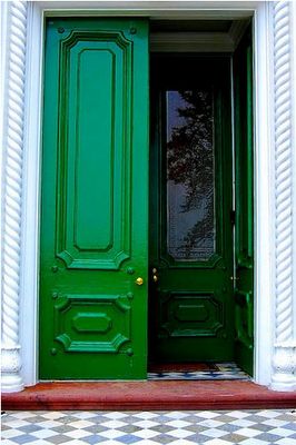
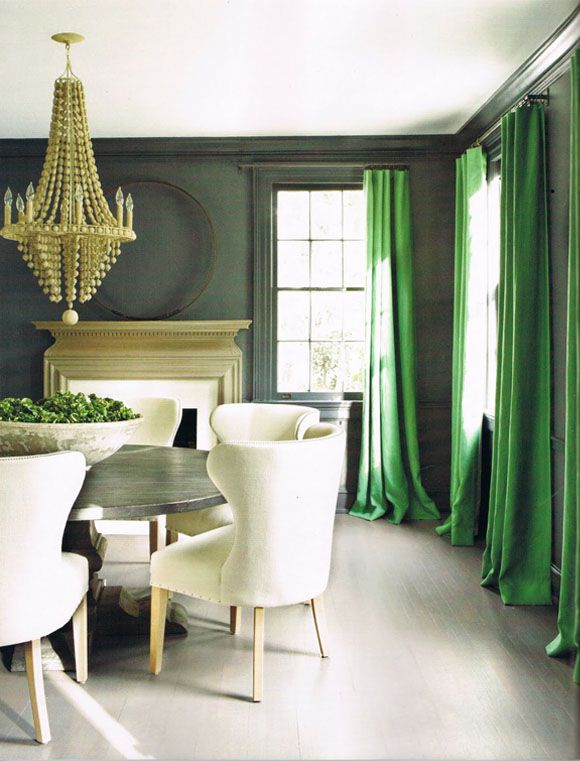
Next, we have Olivia Wilde in an Emerald Sequined Gucci, it can be argued that there has not been a better more glamorous maternity look on the red carpet. She is positively glowing and the gown fits impeccably. The color emerald was particularly popular this past year as it was named the Pantone color of the year. The use of emerald in interior design is fabulous as well, the jewel tone has such a rich texture that just a touch adds depth to a room.

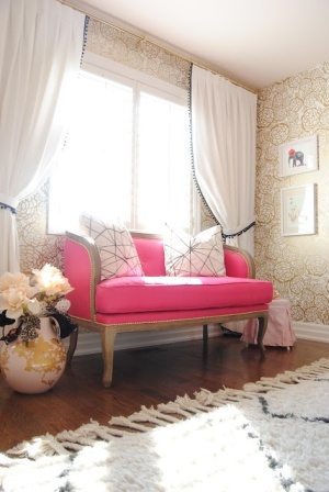
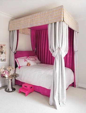
Maria Menounos is radiant in a fabulous pink Max Azria Atelier gown. Maria is beautiful, her California bronzed skin is perfect against the hot pink dress. Pink is tough to carry into interior design unless you are decorating a little girl’s room or a feminine home. We love the images below, each displays beautiful use of this powerful pink hue…

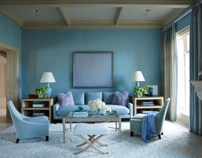
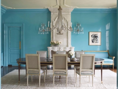
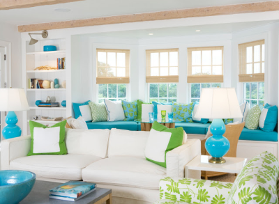
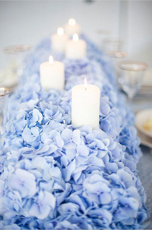
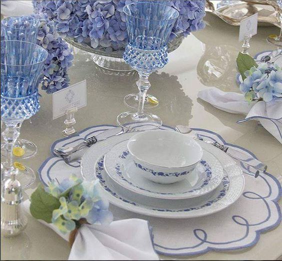
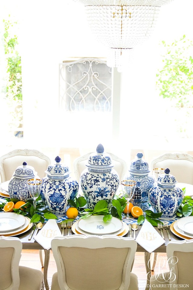
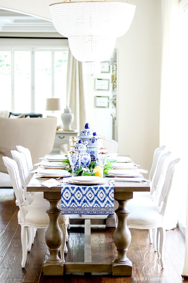
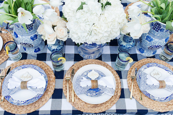
Lupita at the SAG Awards in turquoise Gucci, she nails it yet again. We are loving this bright turquoise, perhaps because, to us, it represents warmer days that seem so far away. Admittedly, the blog “House of Turquoise” never fails to get us salivating at the use of turquoise in interior design. We’ve found some images that represent this color in well styled décor.
Curating a Beautiful Life
Just another WordPress.com site
Curating a Beautiful Life
Luxe Living for Less
Curating a Beautiful Life